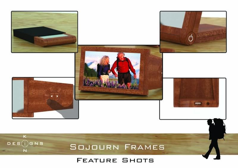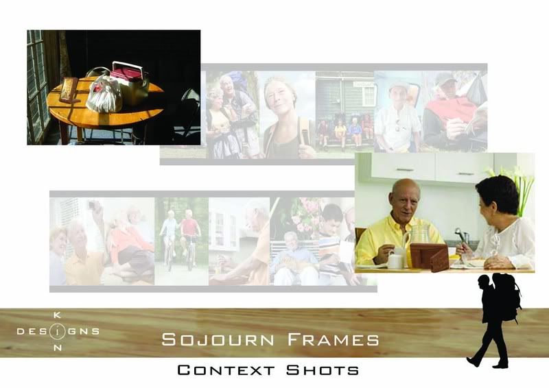


Here are my other boards, will need to try out my new laptop by processing these other renders of mine ... Ooh, and these pics have let me practice photoshop, which is always a good thing. Try the adjustment layers, they're ridiculously powerful in terms of on the fly adjustments of pictures.
The AsiaLine picture was a pamphlet I picked up at the Youngblood market. Quite interesting because it had a warmth I was desiring for my product in urban tribes, with it's rich reds and warm browns. The Zen bar photo was cut out of an MX (these things are awesome, the same with Epoch times, I'm poor and can't afford designer mags, though I should invest in them) and it was for me a mixture of the warmth of wood with the modern feel from the slick geometries. Could just be me.
Question - Why do I suck as a designer? A penny for your thoughts.
5 comments:
kin stop it you don't suck.. what did i say to you before.. stop stressing?!!!!!!!!!!
your foamies = your sketches = your final product = no development... no push, no "ahh" emotional moment.
Ok I concede that my foamies and sketches and final product were quite similar, and i suppose you're right, there wasn't any massive "ahh" emotional moment. So, how do you push and develop a product then? Myself coming from more of a technical background, how would you suggest I approach the form side of things?
look at the use of the product? Im going to make some assumptions here, so if i get something wrong, it's because i dont 100% know your product...
Digital photo frames look they way they do for many reasons (format of photos, traditional portraiture semantic relationship, east of production), but that doesnt mean it's the best way to do it.
dont think im saying this is a 100% perfect, emotionally touching product, but i did a few sketches....
[http://1.bp.blogspot.com/_BoL9zcqFn20/SLvki098TlI/AAAAAAAAADI/90sHIJFviLo/s1600-h/sojourn.jpg]ie on my blog
throw a spanner in the works with LCD size, or shape. think of a good semantic product that requires some interaction (i chose a compass, for example)...
draw the opposite of what the previous sketch was... How would a square feel in your pocket? pointy? uncomfortable?
im not saying waht ive done is the best way to approach it or a perfect product or whatever, just how i personally would have gone about concept generation...
i get that you were going for a warm comfortable feeling and although that the dark wood look is warm, i think it only works on a grand scale with elements that compliment each other...not so much as lone product.
now wheres my penny??
Post a Comment